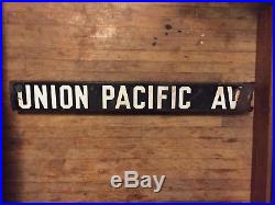
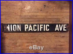
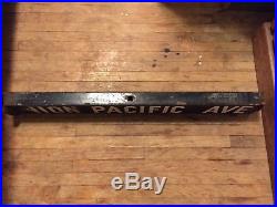
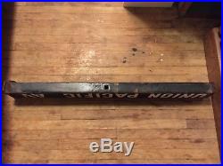
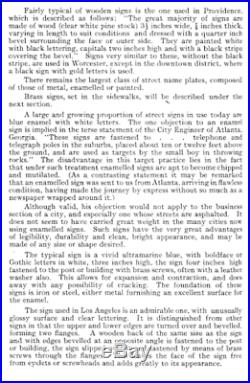
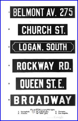
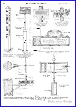
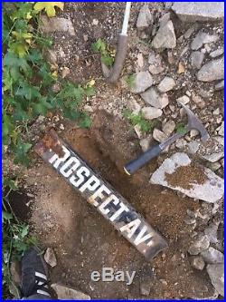
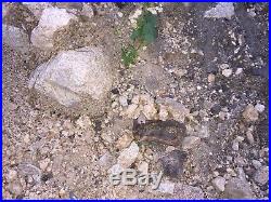
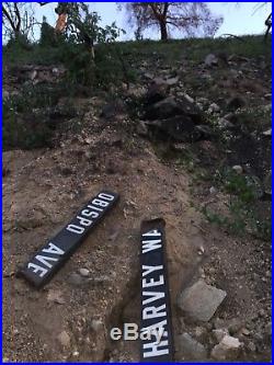

Vintage Early-1900’S Los Angeles Porcelain Enamel Street Sign – UNION PACIFIC AVE. (2-Sided)[Type A] 32″x4″x2 7.5lbs. These signs were installed throughout Los Angeles, California during the first decade of the 1900’s up until the early 1920’s. There are at least three primary incarnations of this sign type. The earliest of which consists of a heavy gauge steel used to form two “U” shaped flanges which are then conjoined by overlapping the flange legs and fusing them together to produce a rectangular enclosure. This style tends to be rather heavy, weighing anywhere from six to eight pounds or more depending on the sign’s overall length. The second style uses a similar gauge steel but instead of two flange legs overlapping, they are made using a single sheet of metal which is bent into its rectangular form and fused together at a single point on the top of the sign with an extra piece of sheet metal running the length and width of the sign directly underneath as a reinforcement. This makes them weigh slightly less. This style features the same materials for its enamel finish along with nearly identical font and character size, albeit with slightly tighter spacing in between. The third style uses the single sheet but is instead fused on the bottom without the extra strip of metal and is finished using a presumably more refined enameling process and/or materials. The color and sheen seem richer and more resilient. The font is larger, in an almost “semi-bold” manner and is a slightly more stout aspect with the character spacing tightened more than ever. The side-by-side comparison below illustrates the differentiation. These signs were the very first metal street signs installed in and all throughout LA County. An endeavor which was funded privately by the Automobile Club of Southern California. Not to be confused with the “circa 1928″ and later signs, which are similar in appearance but instead feature a distinctive trapezoidal cross-section and lighter gauge steel. CONDITION: Due to the manner in which this style of sign was typically fastened and subsequently removed, there is almost always some degree of damage to the side on which it was affixed to its anchor. Removal would disfigure the steel base to varying extents, which caused the porcelain enamel on that end’s tip to chip away, leaving it susceptible to rusting. There are some collectors/sellers who take it upon themselves to cut away the damaged end as close as possible so as to “improve” its “aesthetic” appearance, but I personally feel that such elements are an important part of the sign’s character and history. Isn’t that the very reason why we seek out such items, to begin with? Some of the signs had been hammered into the ground disfiguring one or both ends to varying degrees. In some cases, this resulted in rocks becoming lodged within the sign’s interior. Due to the fragility of porcelain enamel, and depending on the manner in which a lodged rock might be situated, the decision was made to leave the rock in place so as not to damage the sign further. This, however, occurs rarely. Occasionally, a sign might collapse on one end. It should also be noted that many of these signs spent over a half century buried underground, and thus might exhibit a slight “earthy” scent. Lastly, some signs appear to have undergone crudely attempted aesthetic repairs, either of civic or dedicated citizen origin. Essentially, such “repairs” present as minor paint touch-ups. Beyond even the aforementioned issues, many of these signs had survived through both wildfires and mudslides. Needless to say, it’s a wonder they ever made it this far! The provided pictures should portray the necessary condition elements. As long as the item retains a reasonable semblance of its original form, such blemishes are merely a part of its antiquated appeal and unique history. One must, of course, expect some level of degradation when an item reaches the age of antiquity. Which is to say, one hundred years and older. At least these fragments of history still exist! THE MUNICIPAL ART SOCIETY. An Investigation by the Committee on Street Fixtures and Advertising Signs. PUBLISHED BY THE SOCIETY 1909. A large and growing proportion of street signs in use today are blue enamel with white letters. Objection to an enamel sign is implied in the terse statement of the City Engineer of Atlanta. These signs are fastened to telephone and telegraph poles in the suburbs, placed about ten or twelve feet above the ground, and are used as targets by the small boy in throwing rocks. The disadvantage in this target practice lies in the fact that under such treatment enameled signs are apt to become chipped and mutilated. As a contrasting statement it may be remarked that an enameled sign was sent to us from Atlanta, arriving in flawless condition, having made the journey by express without so much as a newspaper wrapped around it. Although valid, his objection would not apply to the business section of a city, and especially one whose streets are asphalted. It does not seem to have carried great weight in the many cities now using enameled signs. Such signs have the very great advantages of legibility, durability and clean, bright appearance, and may be made of any size or shape desired. The typical sign is a vivid ultramarine blue, with boldface or Gothic letters in white, three inches high, the sign four inches high fastened to the post or building with brass screws, often with a leather washer also. This allows for expansion and contraction, and does away with any possibility of cracking. The foundation of these signs is iron or steel, either metal furnishing an excellent surface for the enamel. The sign used in Los Angeles is an admirable one, with unusually glossy surface and clear lettering. It is distinguished from other signs in that the upper and lower edges are turned over and beveled, forming two flanges. A wooden back of the same size as the sign and with edges beveled at an opposite angle is fastened to the post or building, the sign slipped over it and fastened by means of brass screws through the flanges. This leaves the face of the sign free from eyelets or screw-heads and adds greatly to its appearance. Thank You for your consideration. The item “UNION PACIFIC AVE. Vintage Early-1900s Los Angeles Porcelain Enamel Street Sign” is in sale since Saturday, January 27, 2018. This item is in the category “Collectibles\Transportation\Signs”. The seller is “la-relics” and is located in Tujunga, California. This item can be shipped worldwide.
- Country/Region of Manufacture: United States
- Material: Porcelain (Vitreous) Enamel, Steel (Sheet Metal)
- Region: Los Angeles County, L.A., LA, California, CA, USA
- Color/Appearance: Black Background w/White Lettering (Gothic Font)
- Year: 1900s, 1910s, 1920s, 1930s, 1940s, Golden Era
- Type: Vintage, Antique, Authentic, Original, Municipal
